Where the Guard Was Looking
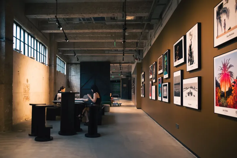
The comment wasn't meant for me. I was standing in a gallery on a slow weekday, a few rooms into a show I'd already decided to like, and a guard was talking to a couple near the doorway. He gestured at the wall behind them and said something like: people come in, they look at the first thing, then they start figuring out how to leave. The middle of the room is where attention goes to die.
I laughed, because it was funny and slightly rude. Then I spent the rest of the afternoon thinking about my own website.
What he was actually describing
A guard sees the room differently than a visitor does. He isn't assessing the art; he's watching bodies move. And what he sees, day after day, is a pattern: people commit fast, then coast.
First wall gets real looking — the pause, the lean-in, the slow read of the label. Last wall gets a version of the same, because people re-engage on the way out; the exit creates a small urgency to have seen something. And the middle? The middle gets crossed. Visitors are physically moving through it while thinking about lunch or the gift shop or the parking meter.
Swap the gallery for a browser tab and almost nothing changes. The top of the page gets genuine attention. The bottom gets a scan. Everything between the fold and the footer is a corridor people walk through at speed, half-reading, thumb already moving.
The homepage is not a room, it's a doorway
My first reaction was to defend the middle. My second was to admit I'd built a homepage that assumed people would wander. Six projects in a grid, equal weight, no hierarchy. It looked fair. It was actually just undecided — I was making a stranger do curatorial work I hadn't done myself.
The fix wasn't a redesign so much as a sequence. One thing to look at first. A second thing that earns the scroll. A third that gives the eye somewhere to land before the corridor. If a visitor only sees the top quarter of the page, I want that quarter to be enough — not a teaser for the real experience further down.
Treat the case study like a hallway
Project pages are where I've applied the guard's observation most aggressively. A case study has three attention zones, and they behave differently.
The opening frame. This is your first wall. People will read two sentences and look at one image, and that's the whole audition. I try to state the problem, show the work, and skip the long warm-up about the client's brand values. If the first image needs a paragraph of setup to make sense, the wrong image is first.
The middle stretch. This is the corridor, and corridors need rhythm — a change of pace every few screens. A pull quote. A short transition. Something to break the wall of body copy. It won't win deep attention, but it stops the scroll from becoming a skip.
The exit. People re-engage here. So the last screen has to actually do something: a result, a detail shot, and a clear next step. Too many portfolios end on a polite thank-you paragraph and then a footer, which is like a gallery whose final wall is a fire door.
A museum-label test
Museum labels do a hard job in about forty words: title, medium, date, and one sentence that makes you look back up at the object. I've started writing a label for every project before I write the page.
If I can't fill in those four fields cleanly, the page isn't ready. And a strange thing happens when the label is good — the page gets shorter. Half the copy exists because I hadn't decided what the work was about yet.
The checklist I run before anything goes live
It's short on purpose. If it takes more than ten minutes, I skip it, and a skipped checklist is decoration.
- Five-second test. Open the page cold. In five seconds, can you say what it is, who it's for, and what to do next? If not, the top is doing too much.
- One idea per screen. Scroll a full screen at a time. Each screen should carry a single thought. Two competing ideas means neither gets read.
- The first wall rule. Whatever sits above the fold has to be the best thing you have, not the most recent or the most polite.
- Corridor check. Count how far you scroll before anything changes visually. If it's more than about three screens, add a break.
- Exit test. Screenshot the bottom. Does it end on a decision, or does it trail off?
- Label test. Write the four-field label. If you stall, the page has a problem the page can't fix.
- Thumb test. Do it all again on a phone, one-handed. Most of your visitors are doing exactly that.
- One path. Count your primary calls to action. If it's more than one, they're competing, and the visitor will pick the easiest one: leaving.
What I actually cut
When I finally rebuilt my own site around this, the changes were small and unglamorous. Three paragraphs off the top of the homepage. Two projects off the grid so one could be large. One entire section of "about my process" moved into a project page where someone might actually want it. A GIF moved from the middle of a case study to the first frame, where it did more work in one second than three screens of explanation had been doing.
None of that is a redesign. It's just editing for the way people look, which is fast at the edges and slow only when something earns it.
The guard was right about the room. The good news is that on a website, you get to decide what the first wall is — and whether the middle deserves to be walked through slowly.