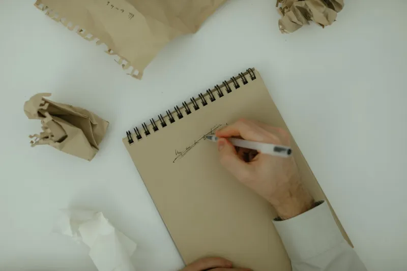
What the Placard Knows: A Museum Wall-Label Exercise for Portfolio Captions
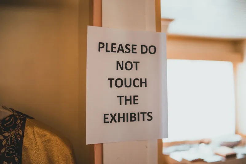
The label that made me stop
Last month I paid twelve dollars to walk through a small county historical society museum. The exhibits were modest: a hand-cranked butter churn, a few dented tin signs, a wedding dress with a repaired hem. I expected to be in and out in twenty minutes. Then I got stuck on a wall label.
It was maybe four lines long. It told me what the object was, when it was made, and one strange fact about the family who owned it. Then it stopped. No thesis. No grand statement about American industry. No paragraph explaining why I should care. The label trusted the object to do the heavy lifting and trusted me to meet it halfway.
I stood there longer than I stood at the object.
On the train home, I opened my phone and looked at my own portfolio captions. They were doing the opposite. They were clearing their throats. They were explaining, qualifying, and apologizing in advance. One caption began with the phrase “This series seeks to interrogate.” I do not think I have ever interrogated anything in my life. I have made things and hoped people would look at them.
That was the moment the museum label became a tool.
What a good wall label actually does
A wall label is not a review. It is not an artist statement. It is not a place to prove you went to art school. It is a tiny piece of signage with three jobs: identify the thing, give the viewer one foothold, and get out of the way.
That is it. The label is not the work. The label is the welcome mat.
Museum labels are also ruthless about space. There is only so much room on a placard, so every sentence has to earn its rent. That constraint is useful for anyone who writes about creative work, whether you are captioning a portfolio page, a gallery submission, or a post on your own site. When you cannot ramble, you start choosing.
The best labels I saw that afternoon followed a pattern I now steal constantly:
- One useful fact: what it is, when it was made, what it is made of.
- One human detail: who used it, where it came from, what went wrong, what the maker noticed.
- No throat-clearing: no “explores,” no “seeks to,” no “invites the viewer to consider.”
That is a low bar, and yet most portfolio captions trip over it.
The three-line test
I started running my captions through a simple test. I call it the three-line test, mostly because I like tests that fit on an index card.
Line one: What is it? Title, year, materials, dimensions if they matter.
Line two: What is one concrete thing someone could know about it? Where the material came from. What constraint shaped it. What mistake became the point. What person handed you the receipt.
Line three: What is one human detail that makes the work feel like it came from a person and not a content calendar? A small decision. A stubborn preference. A thing you noticed on the way to the studio.
If a caption cannot survive those three lines, it is probably not a caption. It is a diary entry wearing a blazer.
A before-and-after from my own desk
Here is a caption I wrote earlier this year for a small mixed-media piece:
“Untitled (Corner Store), 2026, mixed media on paper. This piece explores the relationship between consumer spaces, memory, and the visual language of late capitalism, inviting viewers to reconsider the everyday.”
That caption is not wrong, exactly. It is just useless. It could describe forty different pieces. It tells you nothing you could not guess from the thumbnail. It also makes me sound like a panel discussion.
Here is the rewrite:
“Corner Store Receipt Palette, 2026. Acrylic and paper, 6 by 8 inches. Painted on a receipt from the bodega where I buy coffee. I matched seven colors to the awning before the owner asked if I was okay.”
Same piece. Same year. But now you know where it came from, how big it is, and that a real person had a mildly awkward interaction while making it. You also know I am the kind of person who matches paint to an awning. That is more useful than “late capitalism.”
The exercise: label three works in twenty minutes
This is the part you can do today. It takes twenty minutes, maybe thirty if you get fussy.
- Pick three finished pieces. Not your favorites. Not your worst. Just three that are sitting in a folder or on a portfolio page.
- Set a timer for seven minutes per piece.
- Write only the facts first: title, year, materials, dimensions. No adjectives. No feelings.
- Add one thing you know because you made it. Where the material came from. What you were trying to solve. What went sideways. Who saw it first.
- Cut the first sentence. This is almost always throat-clearing. If the caption still works without it, it was never needed.
- Read it out loud. If you stumble over a phrase, cut the phrase. If you sound like a grant application, rewrite it like you are telling a friend in a parking lot.
- Put it on an index card, literally or digitally. If it does not fit, it is too long.
Do that three times and you will start noticing your own habits. Mine was starting every caption with a clause about what the work “aims to do.” The work does not aim. I aim. The work just sits there, being a thing.
The rules I keep on the wall
I taped a small list above my desk. It is not profound, but it works.
- One useful fact.
- One human detail.
- No thesis statement.
- Do not explain the feeling. Give the viewer a foothold.
- Keep the title separate from the caption. Let the title be weird if it wants to be.
- If the caption is longer than the wall text at a museum, ask yourself why.
- The caption should make the work easier to enter, not harder to leave.
That last one matters. A good label does not trap the viewer in a paragraph. It opens a door and then steps aside. The work should be the thing people remember, not your explanation of it.
What this has to do with a portfolio
A portfolio caption is a wall label for someone who is already scrolling. You have less time than a museum does. You have less context. You have a tiny rectangle of screen and a person who is probably eating lunch.
That is not an excuse to be vague. It is a reason to be clear. The museum label taught me that clarity is not the same as over-explaining. You can be brief and still be inviting. You can give one detail and leave the rest for the work.
I still write long artist statements when a project needs one. Sometimes a body of work needs history, context, and a few paragraphs of thinking. But the caption is not the statement. The caption is the placard. It should know what it is for.
The next time you visit a small museum, read the labels. Not the fancy ones in the big institutions with three curators and a wall of text. The little ones. The ones typed on a label maker and taped to a case. Notice which ones you remember. Notice which ones make you lean in.
Then go home and rewrite one caption with the same discipline. One useful fact. One human detail. No throat-clearing. The placard knows. It has known for a long time.