The Welcome Mat at the End of the Internet: A Month With My 404 Gallery
For most of this site's life, my 404 page was a shrug. A default line of text, a link home, maybe a logo if I remembered. It did the job in the technical sense: it told people something had gone wrong. But it did not tell them anything about where they had landed, or who had built the place, or why they might want to stay a minute longer.
I started thinking about that shrug as a hospitality problem. If someone walks into your studio looking for a room that does not exist, you do not hand them a printed error message and close the door. You point them somewhere useful. You maybe offer them a chair. You definitely do not make them feel stupid for asking.
So for roughly the last month, from mid-October to mid-November 2026, I turned my 404 page into a tiny gallery. Not a clever joke, not a full redesign of the site, just a small room at the end of the internet. Then I tracked what visitors actually did there. This is the behind-the-scenes version.
The room itself
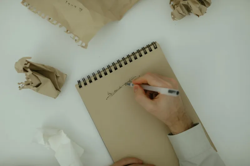
The page has three rotating sketches, each one a little off to the side of my usual work. One is a hand reaching for a doorbell that is not attached to anything. One is a chair with no table. One is a cat sitting in a cardboard box labeled returns. They are not portfolio pieces. They are closer to margin doodles, the kind of thing I usually keep in a drawer because it is not serious enough to show and not bad enough to throw away.
Below the sketches, there is a one-line prompt. For the first week it read: What were you looking for? Later I changed it to: What were you hoping to find? That version got more responses, which makes sense. People are often more willing to talk about hope than about a broken link.
The rest of the page is deliberately plain. A short note explaining that the URL no longer exists or never existed, a link to the portfolio, a link to Studio Notes, and an email address. No maze of navigation. No automatic redirect that pretends nothing happened. The whole thing takes maybe thirty seconds to read, which is about as long as anyone is willing to give a mistake.
I built it in an afternoon. Most of the time went into choosing the sketches, not the code. The code is embarrassingly simple. A small randomizer, a text field that logs the prompt response if someone chooses to submit it, and a lightweight analytics snippet. No cookies, no personal data, no heat maps with faces. Just counts: page views, sketch clicks, prompt submissions, clicks to the portfolio or notes, and how far people scrolled.
What a month of dead ends actually looked like
Over thirty-one days, the page got a little over eleven hundred views. That is not a huge number, but it is not nothing either. Most of those visits came from old URLs that used to work, a few from a stale link in a forum thread, and a handful from a pinned social post where I had typoed my own domain. Classic.
The first thing I noticed was that people did not leave immediately. The average time on page was around twenty-eight seconds. That is not a long visit, but it is long enough to look at a sketch and read a sentence. The default 404 page it replaced had an average time of four seconds, which is basically the time it takes to recognize a dead end and back out.
The second thing was that the sketches got clicked. Not a lot, maybe one in twelve visitors, but more than I expected. The cat in the box was the clear favorite. I had assumed the doorbell sketch would win because it is the most obviously sad-funny one, but no. People like a cat in a box labeled returns. I am not going to argue with data.
The prompt submissions were the most interesting part. I got forty-one responses over the month. Some were practical: looking for the old zine page, trying to find a specific sketch, wondering if I still sold prints. Some were less practical: looking for a reason to keep making things, looking for the version of the site from a screenshot someone saved. One person wrote: I was looking for the page where you talked about quitting. I do not have that page. But I answered them, and we had a short conversation about quitting and not quitting. That felt like the whole point.
The clicks to the portfolio and Studio Notes were steady but modest. About one in seven visitors followed one of those links. The email link got far fewer clicks, maybe a dozen over the month, but the people who used it wrote real notes, not just hey. I will take that trade.
The small mechanics matter more than the concept
I learned a few unglamorous things that I think are worth writing down if you are considering something similar.
First, do not hide the error. The page still says 404 clearly. It still says the URL is not here. Hospitality is not the same as pretending nothing went wrong. People need to know they are in the right place to get help.
Second, give exits that match the likely reason someone arrived. Most of my dead-end traffic was looking for old work, so the portfolio link is prominent. Studio Notes is second because some people were clearly trying to find writing. The email link is last because it is the biggest ask. That order matters more than the visual design.
Third, keep the gallery small. Three sketches is enough. I tried five for a few days and the page felt like a waiting room magazine pile. Three gives people a choice without asking them to curate.
Fourth, the one-line prompt is not a survey. I made that mistake in week two when I added optional fields for name and email. Submissions dropped by half. People will answer a question at a dead end if it feels like a conversation. They will not fill out a form at a dead end. I removed the fields and the responses came back.
What I would change next month
I am keeping the gallery. I like knowing that a broken link is not the end of the interaction. But I would change a few things. I want to rotate the sketches more often, maybe monthly, so the page feels alive rather than like a sealed exhibit. I want to add a short archive of past prompts and my favorite responses, with permission, because the answers have been better than the page itself. And I want to make the email link a little more specific, maybe something like tell me what you were looking for and I will tell you if it exists. That is a clearer invitation than a bare address.
The bigger takeaway is not about 404 pages. It is about what we owe people at the edges of our work. The homepage is the front door. The portfolio is the living room. The 404 page is the moment someone takes a wrong turn in the hallway. You can leave them standing there with a printed error message, or you can put up a small welcome mat and see what happens.
I am not saying every dead end needs a gallery. But I am now suspicious of any dead end that offers nothing but a correction. A month of watching people land on my mistake taught me that curiosity is a better default than cleanup. The page is still an error page. It is just also a room.