Mustard, Reluctantly: A Month of Making Room for a Color I Vetoed
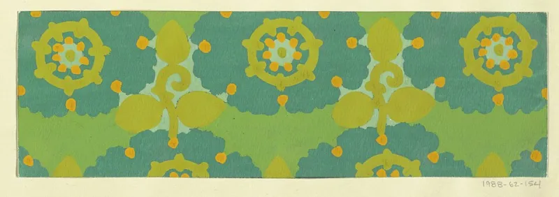
Photo: Unknown artistUnknown artist, Public domain, via Wikimedia Commons
Every studio has a silent no-fly list. Mine had mustard yellow on it for years. Not because I had a reasoned argument against it — no color-theory manifesto, no traumatic diner incident — but because every time I reached for it, I heard a low internal 'nah' and moved on. In October 2026, I decided to spend thirty days with that 'nah.'
The Rule Was Small on Purpose
I didn't want a big, dramatic color experiment. I wanted something I couldn't negotiate my way out of. So the rule was simple: each day, for fifteen minutes, I had to make one small composition — a square no bigger than a coaster — and mustard had to go down first. Not as an accent at the end. First. No hiding it under gray, no turning it into a shadow, no 'maybe it's ochre' loophole.
The smallness mattered. A coaster-sized square is hard to take seriously, which is exactly why it worked. I couldn't claim I was making a masterpiece. I could only notice whether I wanted to keep going or wipe my brush and pretend the timer had gone off early.
I kept a notebook beside me and wrote down three things each day: what I made, how long I resisted, and the first word that came to mind when I looked at the finished square. The words were not flattering. 'Cheap.' 'Loud.' 'Sour.' 'Condiment.' 'Warning.' On day six I wrote 'school bus' and underlined it twice, as if the color had personally cut me off in traffic.
The Excuses Arrived Right on Schedule
I expected resistance. I did not expect it to be so boring. The excuses were not grand. They were administrative. On day three I was too busy. On day five the light was bad. On day eight I convinced myself I didn't have the right mustard, which is a funny thing to believe when you are standing in a studio with three tubes of paint and a hardware store two blocks away.
I bought more anyway. Dijon. Yellow ochre. A greenish gold that looked like a bruise under the store lights. The bruise one turned out to be useful, which was annoying.
Day eleven was the first skip. I had a client edit due and told myself I'd double up the next day. I didn't. But I did notice something useful: I felt relieved. That relief was data. I wasn't avoiding the color because I was tired. I was avoiding it because I had decided, somewhere along the way, that it was not for me.
What Friends Saw That I Didn't
I posted the daily squares to a close-friends story and asked two questions: What does this color make you feel, and do you trust it? The answers were more useful than any color wheel.
A friend who works in branding said, 'It reads cheap to me. Like a clearance sticker.' A painter friend replied, 'That's because you're using it at full saturation next to white. Put it next to cream and it gets expensive.' A third friend, who has never once commented on my work, said, 'It reminds me of my grandmother's kitchen. I mean that as a compliment.'
That last one stuck. My grandmother's kitchen was not stylish. It was warm. It had a linoleum floor and a wall clock that ran four minutes fast. Mustard was not the problem in that memory. Mustard was the light.
By day sixteen I had made a square with mustard and cobalt, and a viewer wrote, 'This is the first one that doesn't look like a warning.' I looked at it again. They were right. The cobalt did something to the mustard. It made it seem deliberate instead of apologetic.
The Color Wasn't the Problem
Here's what I think now: mustard gets asked to do ugly jobs. It is the color of condiment packets, caution tape, school bus bumpers, and hotel hallways that smell like carpet shampoo. It is also the color of late-afternoon light on a kitchen wall, a good piece of toast, and the inside of a sunflower. My aversion wasn't to the hue. It was to the company the hue kept.
Around day twenty-two, I used mustard as a ground under a figure study. It made the skin look alive. Not sunburned. Alive. I would never have tried that a month earlier, because I would have assumed the color would take over. It didn't. It sat underneath and did quiet work.
That was the turn. Not a big conversion. More like a suspicion softening into a fact. By day twenty-seven I was reaching for the bruise-gold tube without negotiating. I still didn't love it. But I had stopped treating it like a personal insult.
One Finished Piece, No Escape Hatch
On day thirty, I made the piece I'd been avoiding: a 16-by-20-inch gouache and colored-pencil composition called 'A Room That Agrees to Mustard.' Five mustard mixes — dijon, ochre, dull gold, a greenish shadow, and a pale butter — plus one warm white. No black. No escape hatch.
It's a small interior: a table, a window, a chair, and a wall that is mostly the color. It's not my favorite thing I've made this year. But it's the most honest. It looks like a room I would actually sit in, which is more than I could say for most of the squares in the first two weeks.
I hung it on the studio wall, not in the portfolio yet. I want to live with it for a while. I want to see whether the color still feels like a dare when I'm not counting days.
What I'm Keeping
The experiment didn't turn me into a mustard person. I still don't want a mustard couch. I still think the color is difficult. But I've stopped confusing difficulty with bad taste. The aversion was mostly habit dressed as taste — a story I had told myself so many times that it sounded like a fact.
Thirty days didn't cure me of anything. It just gave me one more color I can use without flinching. That's a small thing. In a studio, small things add up.